Philion Elaion is an extra virgin olive oil, cold-pressed and of excellent quality,
as evidenced by the extremely low (<0.3%) degree of acidity
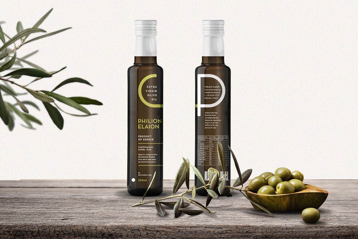
The family which produces the olive oil has commissioned us to develop its packaging and to design the product logo. According quality control analyzes delivered to us, and with respect to the productive process that is done under ideal conditions, we were asked to design a minimalist corporate identity that will communicate cultivation, harvest and the excellent final product.
This question led us to a typographic synthesis of the olive tree, consisting of 2 capital letters (P and Φ), and the use of punctuation (dot) to mark the position of olives during the gathering, under the tree foliage. The tagline "extra virgin olive oil" is part of the logotype, and -of course- the brandname "Philion Elaion", both using clear, geometric but friendly typography. The colors used were yellow-gold of olive oil and dark-brown of the tree trunk.
During the package design, we chose to deconstruct the logo elements by placing them in different positions, focusing on the capital Φ, which highlights the greek origin of the product. Adaptations of the packaging were made in 3 different sizes (250, 500 & 750ml), using silkscreen on the glass (Kouvelas SA), and finished with the printed capsules application on top.